Propriété CSS background-clip
La propriété CSS background-clip définit la zone dans laquelle les background-color et background-image sont peints. Si l'élément n'a pas de background-color ou de background-image, cette propriété n'a aucun effet visuel.
La propriété background-clip fait partie des propriétés CSS3.
Pour découper un arrière-plan sur du texte, une version préfixée par le fournisseur (-webkit-background-clip) est également disponible.
| Valeur initiale | border-box |
|---|---|
| S'applique à | Tous les éléments. S'applique également à ::first-letter et ::first-line. |
| Héritée | Non. |
| Animable | Non. |
| Version | CSS3 |
| Syntaxe DOM | object.style.backgroundClip = "content-box"; |
Syntaxe
Syntaxe de la propriété CSS background-clip
background-clip: border-box | padding-box | content-box | text | initial | inherit;Exemple de la propriété background-clip :
Exemple de la propriété CSS background-clip avec la valeur content-box
<!DOCTYPE html>
<html>
  <head>
    <title>The title of the document</title>
    <style>
      #example {
        border: 3px solid #666;
        padding: 15px;
        background: #ccc;
        background-clip: content-box;
      }
    </style>
  </head>
  <body>
    <h2>Background-clip property example</h2>
    <p>Here the "content-box" value is used.</p>
    <div id="example">
      <p>The background extends to the edge of the content box.</p>
    </div>
  </body>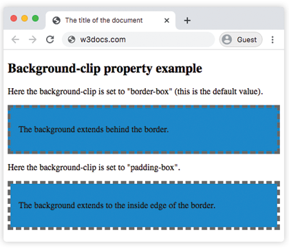
</html>Dans l'exemple suivant, observez la différence entre les valeurs "padding-box" et "border-box".
Exemple de la propriété background-clip avec les valeurs "padding-box" et "border-box" :
Exemple de la propriété CSS background-clip avec la valeur border-box
<!DOCTYPE html>
<html>
  <head>
    <title>The title of the document</title>
    <style>
      #example1 {
        border: 5px dashed #666;
        padding: 15px;
        background: #1c87c9;
        background-clip: border-box;
      }
      #example2 {
        border: 5px dashed #666;
        padding: 15px;
        background: #1c87c9;
        background-clip: padding-box;
      }
    </style>
  </head>
  <body>
    <h2>Background-clip property example</h2>
    <p>Here the background-clip is set to "border-box" (this is the default value).</p>
    <div id="example1">
      <p>The background extends behind the border.</p>
    </div>
    <p>Here the background-clip is set to "padding-box".</p>
    <div id="example2">
      <p>The background extends to the inside edge of the border.</p>
    </div>
  </body>
</html>Dans cet exemple, l'arrière-plan est peint à l'intérieur du texte au premier plan.
Exemple de la propriété background-clip avec la valeur "text" :
Exemple de la propriété CSS background-clip avec la valeur text
<!DOCTYPE html>
<html>
  <head>
    <title>The title of the document</title>
    <style>
      #example {
        border: 3px dashed #1ebf42;
        padding: 15px;
        background: #1c87c9;
        background-clip: text;
        -webkit-background-clip: text;
        color: transparent;
      }
    </style>
  </head>
  <body>
    <h2>Background-clip property example</h2>
    <p>Here the background-clip is set to "text"</p>
    <div id="example">
      <p>The background is painted within the foreground text.</p>
    </div>
  </body>
</html>Valeurs
| Valeur | Description | Tester » |
|---|---|---|
| border-box | L'arrière-plan apparaît derrière la bordure. Il s'agit de la valeur par défaut. | Tester » |
| padding-box | L'arrière-plan apparaît à l'intérieur de la bordure. | Tester » |
| content-box | L'arrière-plan s'étend jusqu'au bord de la boîte de contenu. | Tester » |
| text | L'arrière-plan est peint à l'intérieur du texte au premier plan. | Tester » |
| initial | Définit la propriété à sa valeur par défaut. | Tester » |
| inherit | Hérite la propriété de son élément parent. |
Pratique
Parmi les valeurs suivantes, laquelle peut être utilisée avec la propriété 'background-clip' en CSS ?