Propriété CSS stroke-linecap
La propriété stroke-linecap spécifie la forme des extrémités du trait d'un chemin dans SVG.
Lorsqu'elle est utilisée en tant qu'attribut de présentation, elle peut être remplacée par CSS. Lorsqu'elle est utilisée dans des styles en ligne, elle prime sur le CSS externe.
INFO
La propriété stroke-linecap peut être utilisée à la fois en tant que propriété CSS et en tant qu'attribut de présentation SVG. Elle peut être appliquée à n'importe quel élément mais n'affecte que les suivants : <altGlyph>, <path>, <polyline>, <line>, <text>, <textPath>, <tref> et <tspan>.
| Valeur initiale | butt |
|---|---|
| S'applique à | Éléments de forme et de contenu textuel. |
| Héritée | Oui. |
| Animable | Non. |
| Version | Spécification SVG 1.1 |
| Syntaxe DOM | Object.strokeLinecap = "round"; |
Syntaxe
Syntaxe CSS de stroke-linecap
css
stroke-linecap: butt | square | round | initial | inherit;Exemple de la propriété stroke-linecap :
Exemple de code CSS stroke-linecap
html
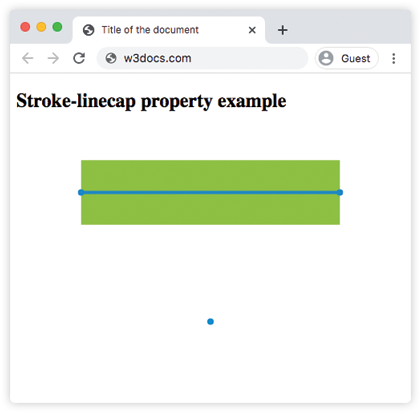
<!DOCTYPE html>
<html>
  <head>
    <title>Title of the document</title>
  </head>
  <body>
    <h2>Stroke-linecap property example</h2>
    <svg viewBox="0 0 6 4">
      <!-- Effect of the "butt" value -->
      <path d="M1,1 h4" stroke="#8ebf42"
        stroke-linecap="butt" />
      <!-- Effect of the "butt" value on a zero length path -->
      <path d="M3,3 h0" stroke="#8ebf42"
        stroke-linecap="butt" />
      <!--
        the following pink lines highlight the
        position of the path for each stroke
        -->
      <path d="M1,1 h4" stroke="#1c87c9" stroke-width="0.05" />
      <circle cx="1" cy="1" r="0.05" fill="#1c87c9" />
      <circle cx="5" cy="1" r="0.05" fill="#1c87c9" />
      <circle cx="3" cy="3" r="0.05" fill="#1c87c9" />
    </svg>
  </body>
</html>Résultat
Exemple de la propriété stroke-linecap avec la valeur « round » :
Exemple CSS stroke-linecap round
html
<!DOCTYPE html>
<html>
  <head>
    <title>Title of the document</title>
  </head>
  <body>
    <h2>Stroke-linecap property example</h2>
    <svg viewBox="0 0 6 4">
      <!-- Effect of the "round" value -->
      <path d="M1,1 h4" stroke="#8ebf42" stroke-linecap="round" />
      <!-- Effect of the "round" value on a zero length path -->
      <path d="M3,3 h0" stroke="#8ebf42" stroke-linecap="round" />
      <!--
      the following pink lines highlight the
      position of the path for each stroke
      -->
      <path d="M1,1 h4" stroke="#1c87c9" stroke-width="0.05" />
      <circle cx="1" cy="1" r="0.05" fill="#1c87c9" />
      <circle cx="5" cy="1" r="0.05" fill="#1c87c9" />
      <circle cx="3" cy="3" r="0.05" fill="#1c87c9" />
    </svg>
  </body>
</html>Exemple de la propriété stroke-linecap avec la valeur « square » :
Exemple CSS stroke-linecap square
html
<!DOCTYPE html>
<html>
  <head>
    <title>Title of the document</title>
  </head>
  <body>
    <h2>Stroke-linecap property example</h2>
    <svg viewBox="0 0 6 4">
      <!-- Effect of the "square" value -->
      <path d="M1,1 h4" stroke="#8ebf42" stroke-linecap="square" />
      <!-- Effect of the "square" value on a zero length path -->
      <path d="M3,3 h0" stroke="#8ebf42" stroke-linecap="square" />
      <!--
        the following pink lines highlight the
        position of the path for each stroke
        -->
      <path d="M1,1 h4" stroke="#1c87c9" stroke-width="0.05" />
      <circle cx="1" cy="1" r="0.05" fill="#1c87c9" />
      <circle cx="5" cy="1" r="0.05" fill="#1c87c9" />
      <circle cx="3" cy="3" r="0.05" fill="#1c87c9" />
    </svg>
  </body>
</html>Valeurs
| Valeur | Description |
|---|---|
| butt | Termine le trait par un angle vif. Sur un sous-chemin de longueur nulle, le chemin ne sera pas rendu. Il s'agit de la valeur par défaut. |
| square | Prolonge le trait au-delà de la longueur du chemin. |
| round | Arrondit les points de départ et d'arrivée. |
| initial | Mot-clé CSS standard qui réinitialise la propriété à sa valeur par défaut. |
| inherit | Mot-clé CSS standard qui hérite de la propriété de son élément parent. |
Pratique
Quel impact la propriété CSS 'stroke-linecap' a-t-elle ?