Propriété CSS width
La propriété CSS width définit la largeur d’un élément. La largeur n’inclut pas border, padding ni margin. Notez que cela s’applique au modèle de boîte par défaut content-box ; avec box-sizing: border-box, le padding et la bordure sont inclus dans le calcul de la largeur.
La propriété width s’applique à tous les éléments, sauf aux éléments en ligne non remplacés, aux lignes de tableau et aux groupes de lignes (c.-à-d. <thead>, <tfoot> et <tbody>).
La propriété accepte une longueur CSS (px, pt, em, etc.), un pourcentage ou le mot-clé auto.
Notez que la valeur en pourcentage est basée sur la largeur de l’élément parent (le bloc conteneur). Pour les éléments positionnés de manière absolue, le pourcentage est calculé par rapport à la largeur de la boîte de padding du bloc conteneur.
La propriété width peut être remplacée par les propriétés min-width et max-width.
INFO
Les valeurs de longueur négatives sont interdites.
| Initial Value | auto |
|---|---|
| Applies to | All elements except non-replaced inline elements, table rows, and row groups. |
| Inherited | No. |
| Animatable | Yes. The width of an element is animatable. |
| Version | CSS1 |
| DOM Syntax | Object.style.width = "300px"; |
Syntaxe
Syntaxe de la propriété CSS width
width: auto | length | percentage | initial | inherit | fit-content | min-content | max-content | stretch;Exemple de la propriété width spécifiée en “%” :
Exemple de la propriété CSS width avec la valeur %
<!DOCTYPE html>
<html>
  <head>
    <title>Title of the document</title>
    <style>
      div {
        width: 50%;
        background-color: #1c87c9;
      }
    </style>
  </head>
  <body>
    <h2>Width property example</h2>
    <div>
      Lorem Ipsum is simply dummy text of the printing and typesetting industry. Lorem Ipsum has been the industry's standard dummy text ever since the 1500s, when an unknown printer took a galley of type and scrambled it to make a type specimen book.
    </div>
  </body>
</html>Résultat
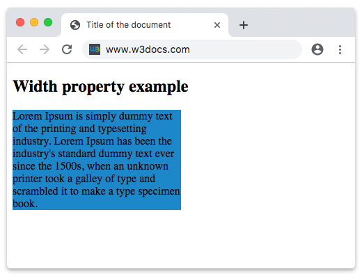
Dans l’exemple donné, la largeur du conteneur div est de 50 %.
Dans l’exemple suivant, la largeur du premier élément est de 250px et celle du deuxième élément est de 25em :
Exemple de la propriété width spécifiée en “px” et “em” :
Exemple de la propriété CSS width avec les valeurs px et em
<!DOCTYPE html>
<html>
  <head>
    <title>Title of the document</title>
    <style>
      div.t1 {
        width: 250px;
        border: 1px solid black;
        background-color: #1c87c9;
      }
      div.t2 {
        width: 25em;
        border: 1px solid black;
        background-color: #8ebf42;
      }
    </style>
  </head>
  <body>
    <h2>Width property example</h2>
    <h3>width: 250px</h3>
    <div class="t1">
      Lorem Ipsum is dummy text of the printing and typesetting industry. Lorem Ipsum has been the industry's standard dummy text ever since the 1500s when an unknown printer took a galley of type and scrambled it to make a type specimen book. It has survived not only five centuries, but also the leap into electronic typesetting, remaining essentially unchanged. It was popularised in the 1960s with the release of Letraset sheets containing Lorem Ipsum passages, and more recently with desktop publishing software like Aldus PageMaker including versions of Lorem Ipsum.
    </div>
    <h3>width: 25em</h3>
    <div class="t2">
      Lorem Ipsum is simply dummy text of the printing and typesetting industry. Lorem Ipsum has been the industry's standard dummy text ever since the 1500s when an unknown printer took a galley of type and scrambled it to make a type specimen book. It has survived not only five centuries, but also the leap into electronic typesetting, remaining essentially unchanged. It was popularised in the 1960s with the release of Letraset sheets containing Lorem Ipsum passages, and more recently with desktop publishing software like Aldus PageMaker including versions of Lorem Ipsum.
    </div>
  </body>
</html>Valeurs
| Value | Description | Play it |
|---|---|---|
| auto | Le navigateur calculera une largeur pour l’élément spécifié. C’est la valeur par défaut. | Play it » |
| length | Définit la largeur en px, pt, cm, etc. | Play it » |
| percentage | Définit la largeur en pourcentage de l’élément conteneur. | Play it » |
| initial | Fait en sorte que la propriété utilise sa valeur par défaut. | Play it » |
| inherit | Hérite de la propriété de son élément parent. | |
| fit-content | Calcule la largeur en fonction de la taille intrinsèque du contenu. | Play it » |
| min-content | Calcule la largeur en fonction de la taille minimale du contenu. | Play it » |
| max-content | Calcule la largeur en fonction de la taille maximale du contenu. | Play it » |
| stretch | Étire l’élément pour remplir le conteneur. | Play it » |
Practice
Quelle est la fonction de la propriété 'width' en CSS ?